About
Products
OEM
Solutions
News & Insights
Request Quote
Our Products
Compressed Air Solutions
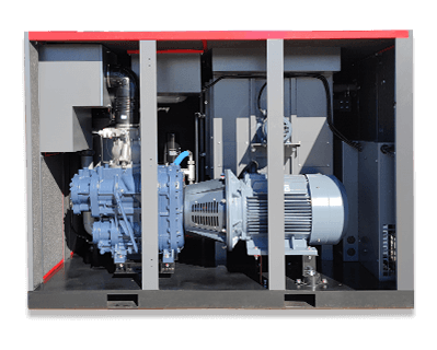
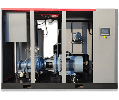
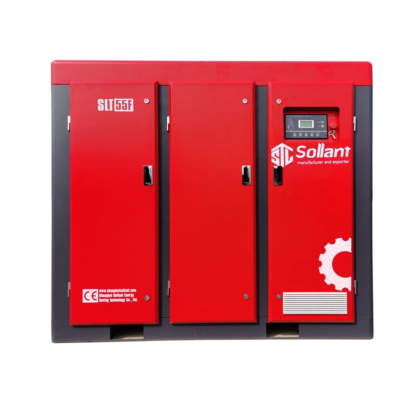
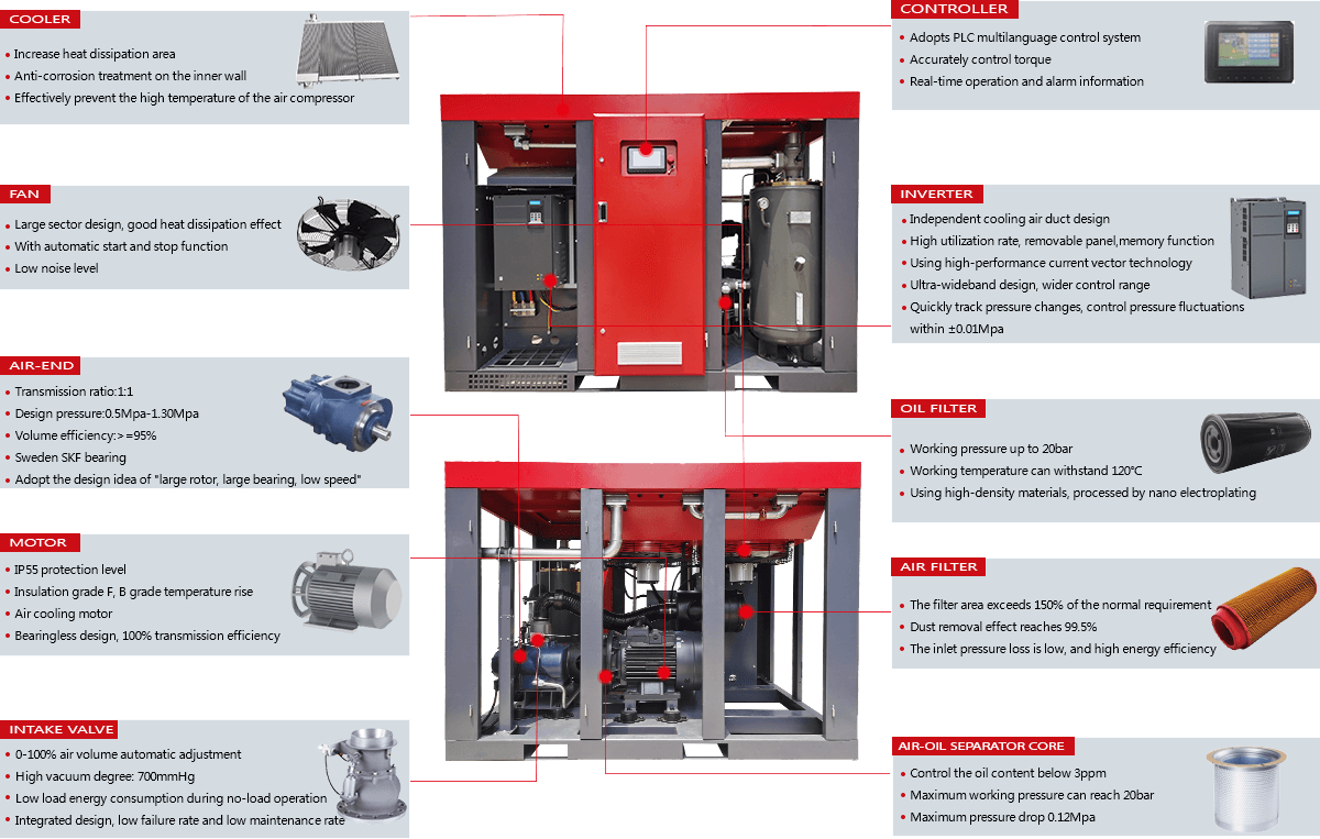
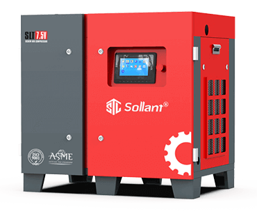
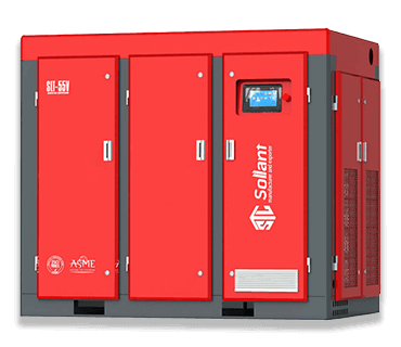
Screw Air Compressor
Oil Free Compressor
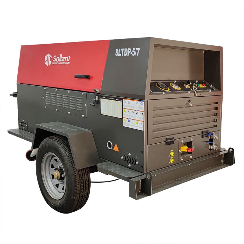
Diesel Portable Compressor
Gas Compressor
Specialty Compressor
Air Treatment
Screw Air Compressor
View All
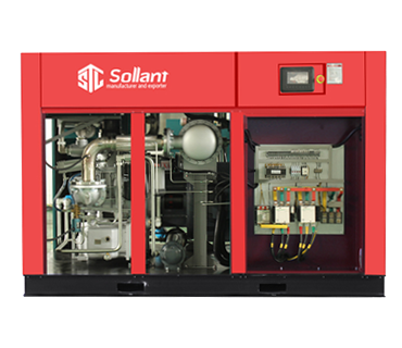
Fixed Speed Screw Compressor
7.5kW – 315kW · 7–13 bar
Energy Saving
PM VSD Screw Compressor
7.5kW – 250kW · Save 30%+
Hot
4-in-1 Integrated Compressor
Compressor + Dryer + Tank + Filter
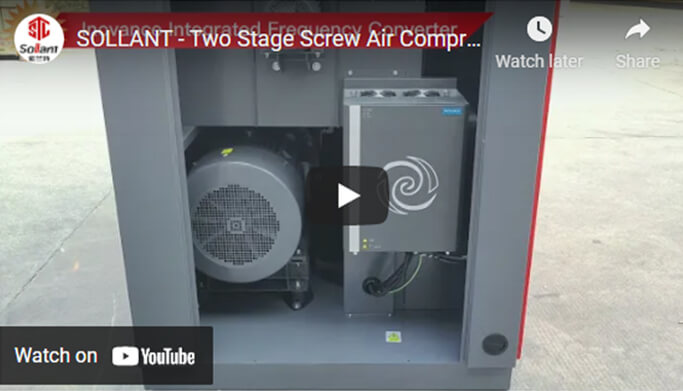
Two-Stage Screw Compressor
22kW – 250kW · High Efficiency
Low Pressure Compressor
2–5 bar · Textile & Cement
Single Phase Compressor
3.7kW – 7.5kW · 220V 50/60Hz
Medium Pressure Compressor
15–40 bar · Laser / PET
Containerized Compressor
Outdoor Ready · Weatherproof
Oil Free Compressor
View All
Class 0
Dry Oil Free Screw Compressor
45–250kW · 100% Oil Free
Water Injected Compressor
15–110kW · Low Temperature
Oil Free Scroll Compressor
2.2–45kW · Ultra Quiet
Oil Free Screw Blower
37–250kW · Wastewater
Diesel Portable Compressor
View All
Bestseller
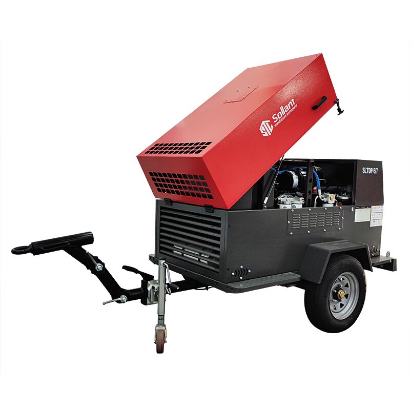
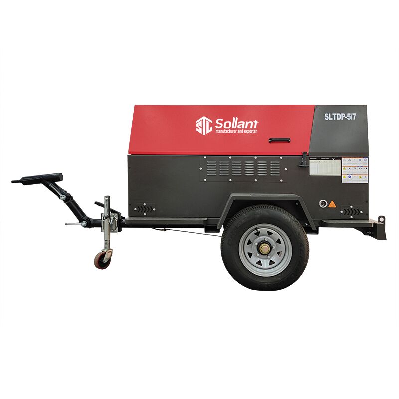
Towable Diesel Compressor
185–1500 CFM · 7–35 bar
Truck Mounted Compressor
Engine Driven · Mobile Unit
High Pressure Diesel
25–35 bar · Mining & Drilling
Gas Compressor
View All
Diaphragm Compressor
Leak-free · High Purity Gas
CNG Natural Gas Compressor
CNG Filling Station
Nitrogen Compressor
N₂ Boosting · Industrial
Biogas & LPG & Ammonia
Custom Gas Solutions
Specialty Compressor
View All
Hot
Laser Cutting Compressor
16–40 bar · Clean Dry Air
Centrifugal Air Compressor
Large Volume · 200+ kW
High Pressure Piston
30–350 bar · PET Blowing
Compressed Air Treatment
View All
Essential
Refrigerated Air Dryer
Dew Point 2–10°C · Energy Saving
Air Receiver Tank
0.6–20 m³ · ASME Standard
Line Filter & Separator
Oil / Water / Dust Removal
ISO 9001 Certified
24-Month Warranty
OEM & ODM Support
Factory Direct Price
All products→
 Energy Saving
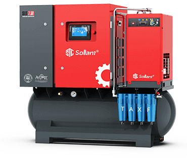 Hot
Hot